
Overview
With 12 new broadband propositions launching on top of an already full portfolio of products a redesign of the broadband section of the Vodafone website was needed to cope with all the new content.
The main focus was to structure and align all the new content in a way that alleviated customer pain points experienced with the old designs and therefore improve customer experience within the section.
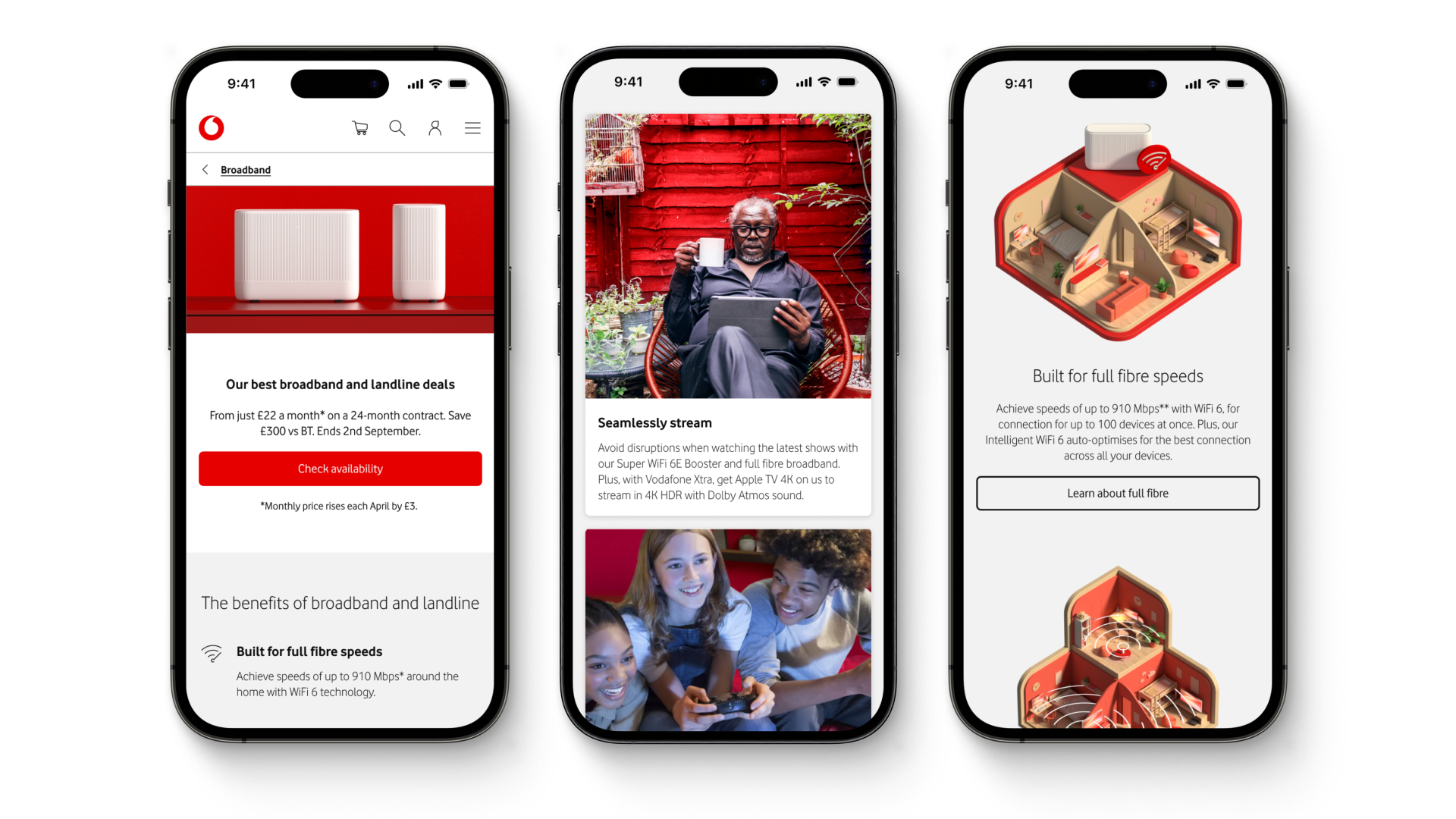
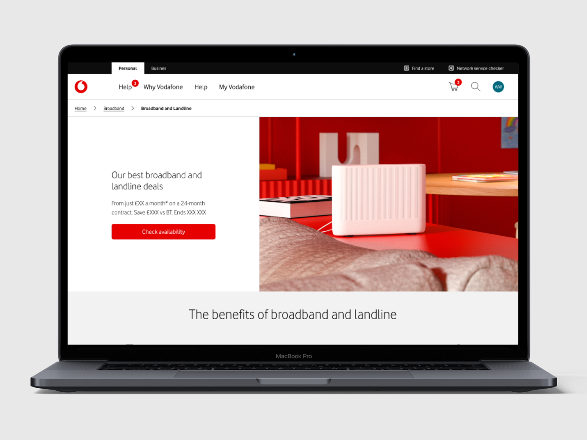
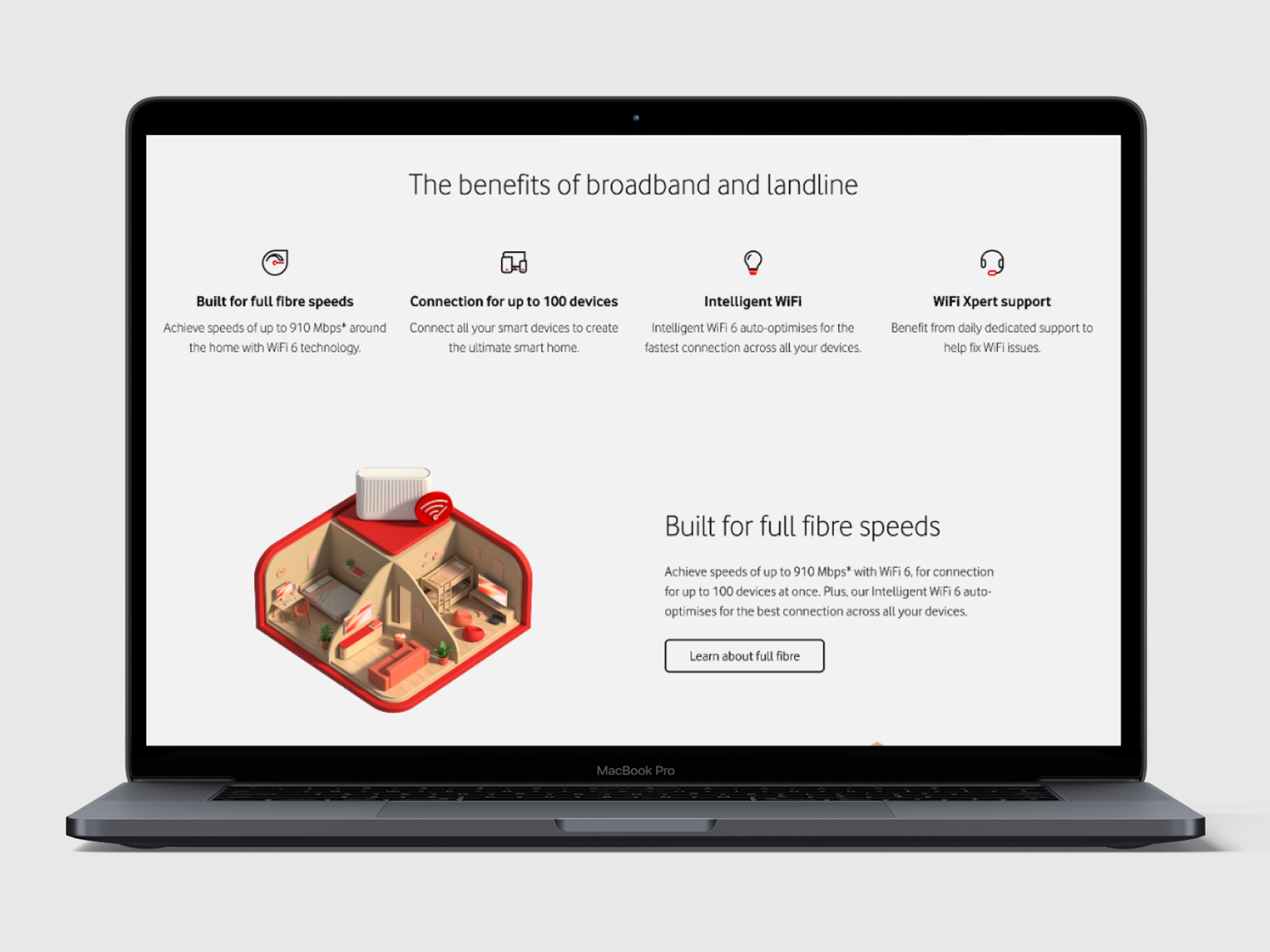
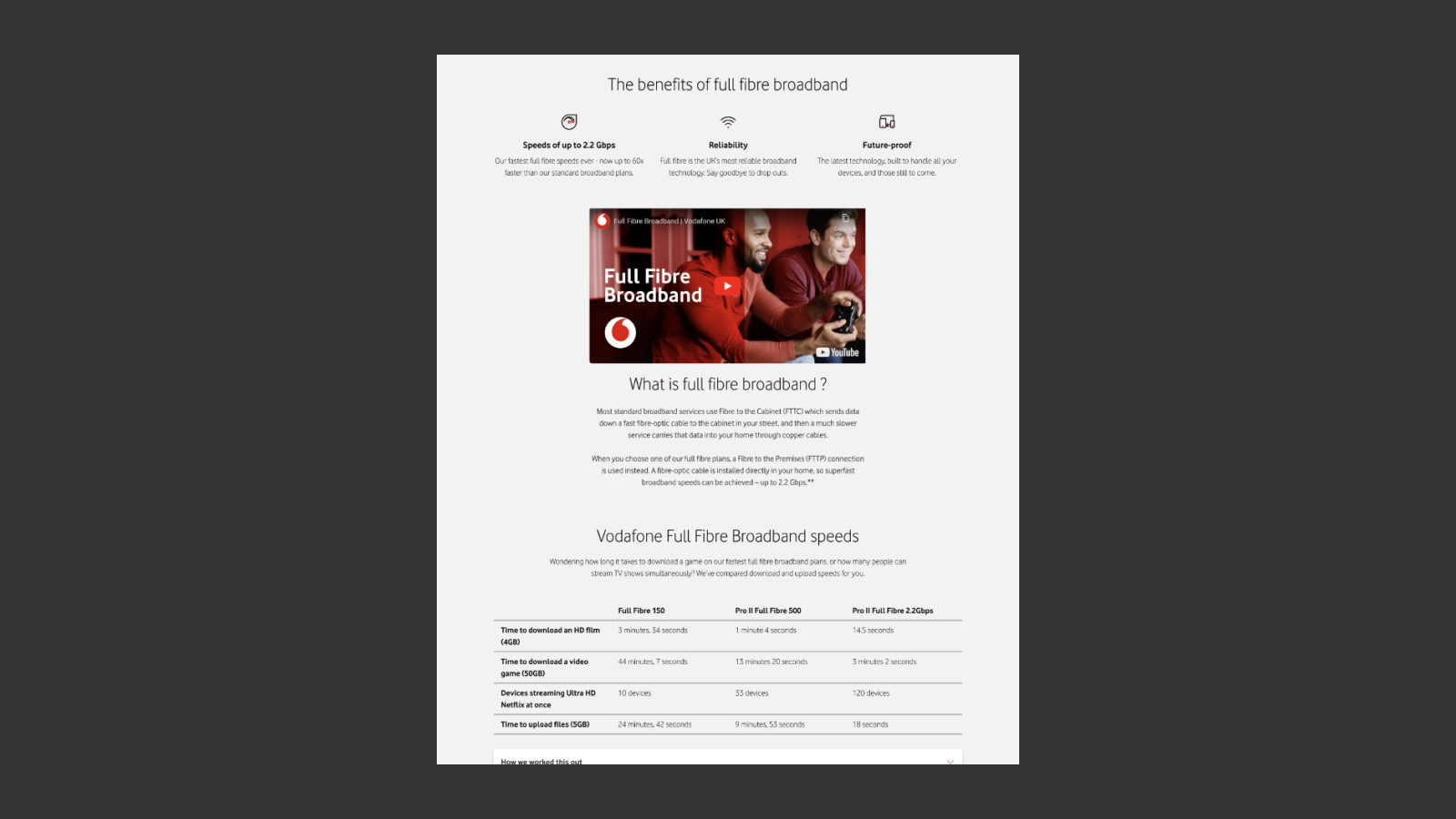
Selected screens from the broadband section
Analysis of existing pages
The interactive FigJam below shows part of the initial research and analysis undertaken to understand how the pages were performing from conversion and customer experience perspectives.
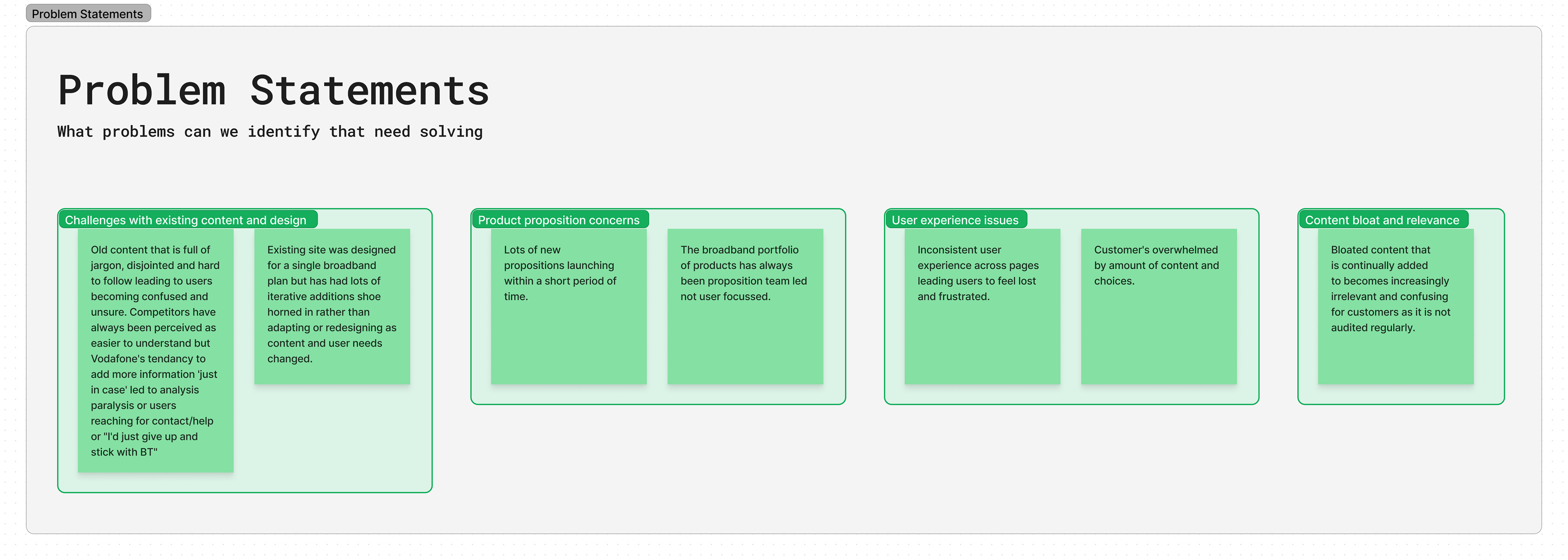
Problem statements
Following the research and analysis phase, problem statements were workshopped
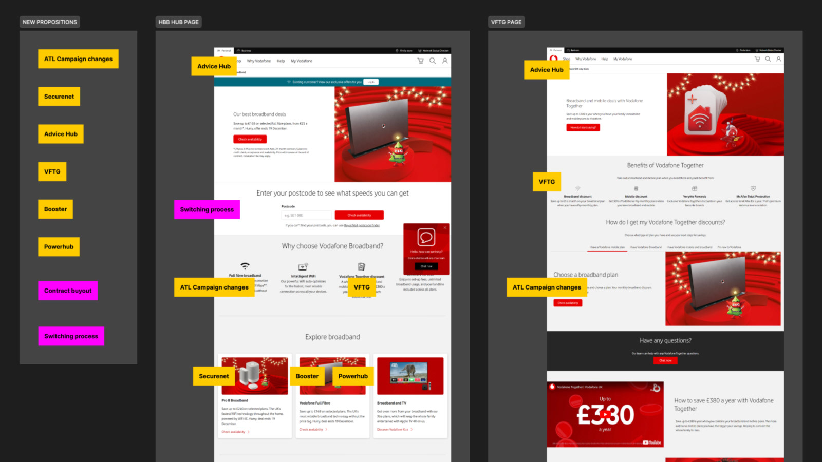
Content mapping
The new content was loosely mapped onto existing page layouts to see where it was relevant and to help visualise the scope of work. This exercise reinforced the idea that a redesign was needed because it highlighted most of the problem statements.
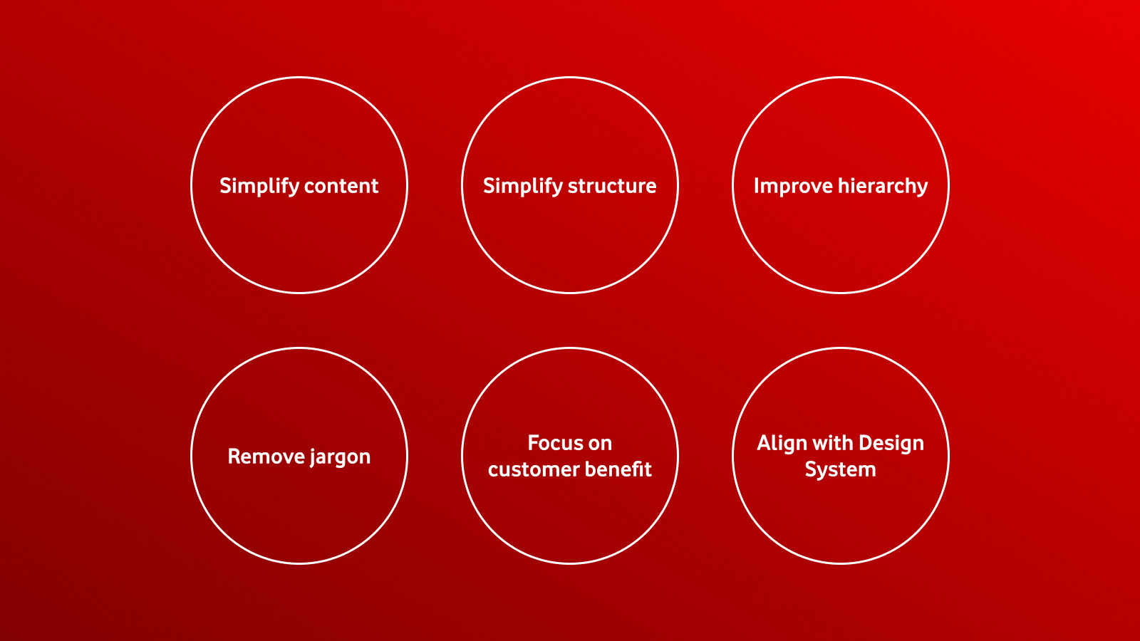
Establishing and testing principles
Once the content map was established it was clear to see that we would need some guiding principles to ensure that we answered our problem statements effectively.
I used the principles I created in the Vodafone Design Language project to test their validity for that project and to act as
Generating wireframes
Wireframes were produced to help visualise the intended new structure of the pages and to get a sense of how all the new content would fit together. These were also used to determine which components would be used within the new messaging matrix framework.
These were also created as working examples of the Vodafone Design Language principles that I was working on simultaneously.
Messaging matrix
I suggested key changes to the way messaging matrices were presented and signed off. By dropping design assets and copy into components from the wireframes in Figma, (instead of a generic powerpoint slide), stakeholders were able to see long and short versions of copy alongside design assets in the correct context. This allowed them to comment and sign off messaging and assets together within the Figma file. This drove efficiency, led to fewer changes and produced a more consistent approach across teams, eliminating work duplication and removing several layers of stakeholder sign off.
This added benefit to this was it created a toolkit of signed off components that could then be used (and tweaked based on context) to populate the wireframes for the High fidelity designs.

Figma based messaging matrix allowing in context sign review and sign off of key messages and assets
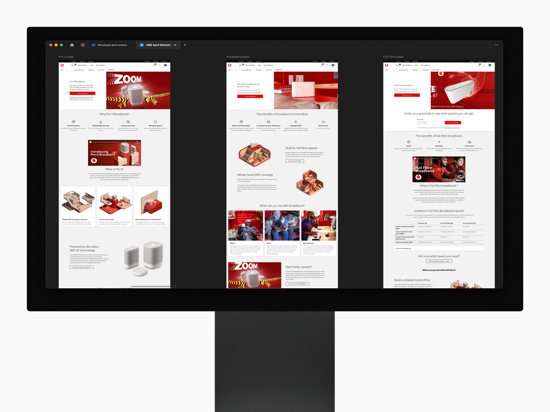
High fidelity designs
The final design screens were produced taking top level components from the messaging matrix and then tweaking them based on contextual need. This drag and drop approach led to an incredibly efficient workflow.
Selected interactive prototypes below:

View the full screens
Content asset creation
Various key visual assets were created to match up with the new product propositions and highlight the new range of broadband products.


Talk about content changes..
EG: changing from plan cards to comparison table: Customers felt they were selecting a plan and then were confused after putting their postcode in to see their previous selection wasn't available. "Why show me something I can't have?" Comparison table allowed users to clearly understand the difference between plans without giving the impression they were making a selection
Simplifying content, removing jargon, focusing on user needs
Lead with key customer benefits over convoluted product names or jargon. Eg: 'Super WiFi 6E Booster' becomes 'Reliable WiFi throughout your home' all headings should be a reason to choose/believe.
Show analysis of old pages
Key design changes and considerations
Stripping back content to remove the overwhelm users were experiencing to create a simpler and more premium experience.
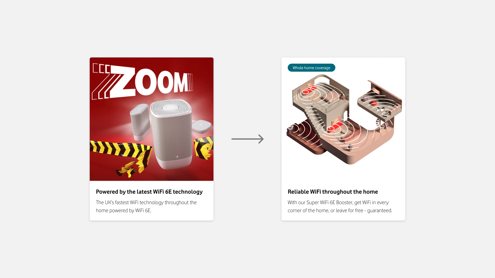
Brand claims and advertising assets were meaningless to customers. These were replaced with tangible customer benefits backed up with useful illustrative images.

Creating predictable, but flexible, design patterns with consistent use of components across pages.
Capturing traffic through intelligent use of SEO data for headlines.

Swapping components to more suitable alternatives.
Users felt the plan cards were enabling them to select a plan when in fact they were being used to compare plans. Swapping to a table component allowed customers to compare information much more easily and didn't give the impression they were making a selection.
Hypotheses (are these needed here?): Is this a separate project?
There we're several key areas that we wanted to understand
- Simplified content with better grouping will make Pro II easier to understand and make it more appealing.
- Highlighting tangible customer benefits over brand led marketing shouts would improve customers understanding of broadband.
- More consistent component use would help users orientate themselves better, reducing the need to learn each page layout.
My contributions
I suggested doing the full redesign in the first place! The expectation from the propositions team was that we would iteratively add content to our existing pages, but already understanding a key pain point for customers enabled me to suggest tackling the project in a different way.
As the sole designer on the project I was involved with every stage of the project. I was responsible for:
• Running initial workshops with content, brand and propositions teams; setting out a structure for tackling the project
• Implemented improved ways of working across teams including restructuring how messaging matrices were presented
• Working closely with research, SEO, brand and design system teams
• Content blocking, wireframing and high fidelity designs of all pages, including content assets
• Presenting to stakeholders at every stage to gather feedback and expert input
• Creating necessary variants of pages and assets for testing
• Presenting project in design system catch ups. (This project was used as the working example for testing Design Language principles that I'd been working on simultaneously).