Overview
Initial concept designs to establish the look and feel for Morrisons wine. At the time of work Morrisons had no online retail presence and so these concepts were developed and used to create Morrisons first online shop.
Visual cues
It was important to create a consistent brand experience between in-store and online. Visual cues were taken from in-store and translated to the digital experience. The dark tones and wood paneling of the shop aisles were carried through to create a sophisticated feel, punctuated with the loose brand typography and splashes of wine to help it feel less stuffy and more approachable.
Expertise
Morrisons are synonymous with excellent in-store knowledge and expertise at their Market Street counters. They wanted to bring this expertise to online customers, allowing them to branch out from their usual choices and choose new wines for their palette.
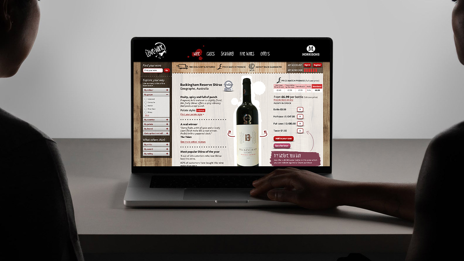
To differentiate from competitors a wealth of knowledge and expertise was added to the product pages. Awards, tasting notes, palette style, reviews, social proof, food pairings, produce stories and similar wines all add to the learning experience.
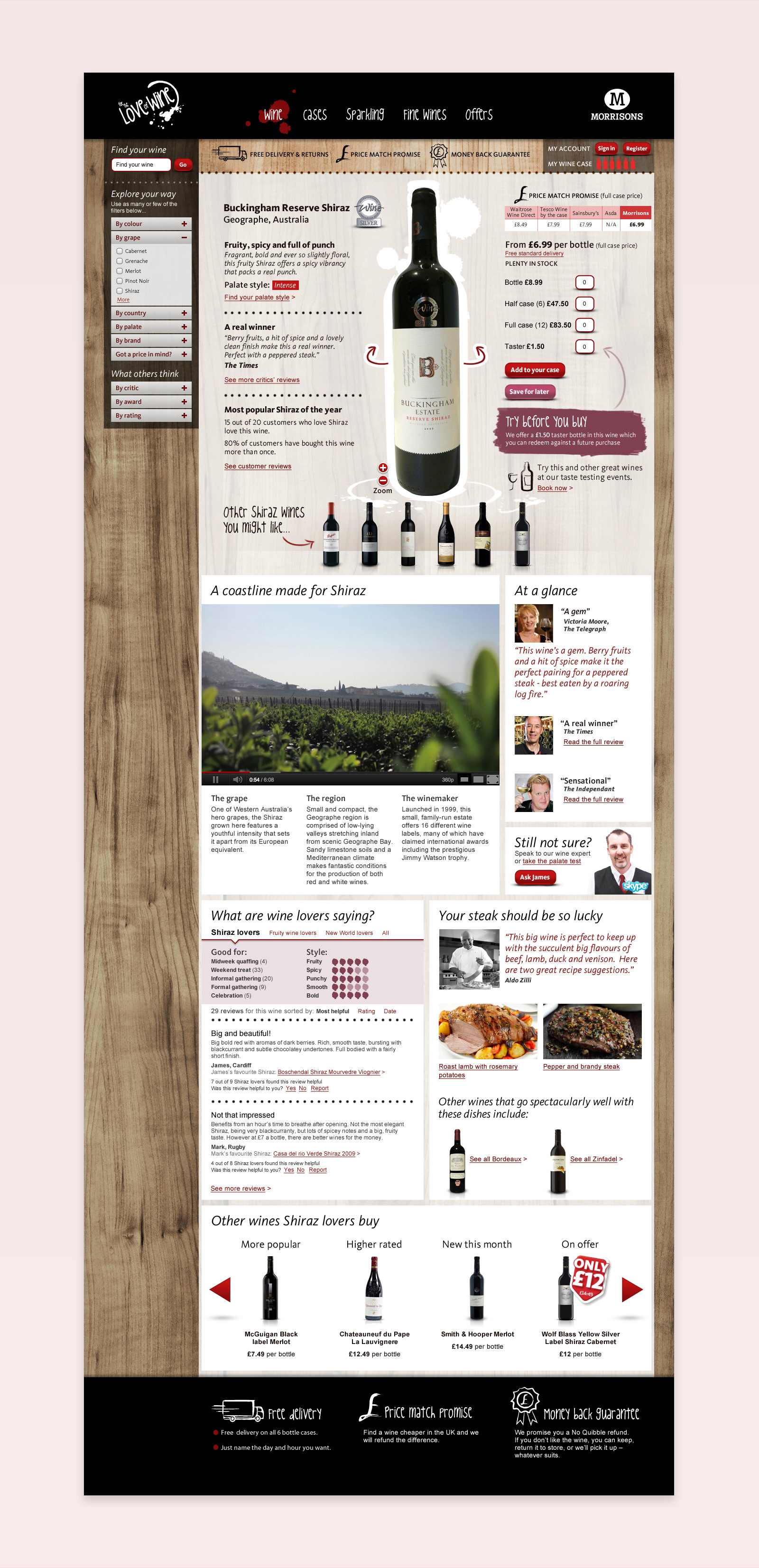
Product page showcasing vast breadth of expert content.
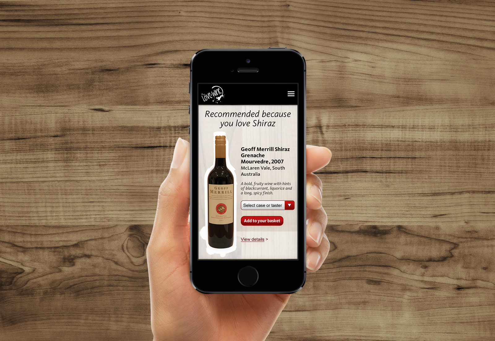
Wine recommendation screen.
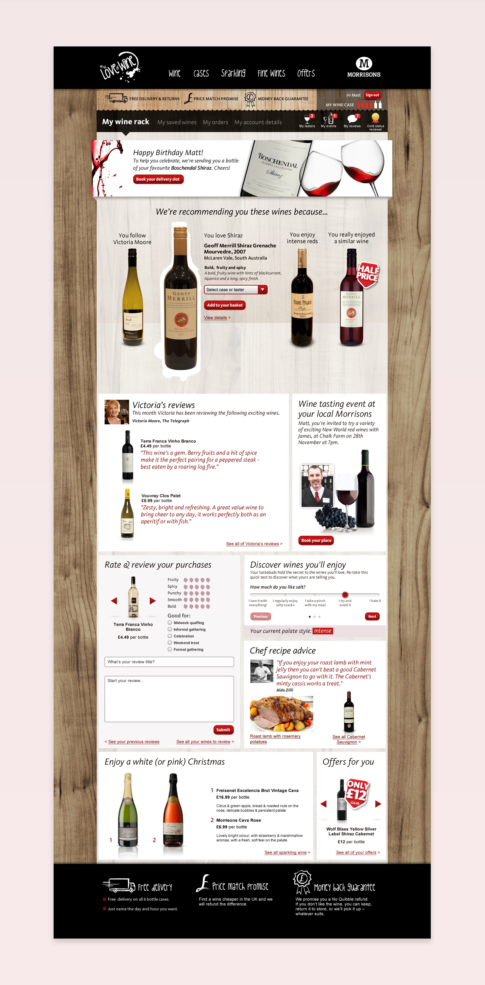
Wine rack page highlighting recommendations, reviews and personalised offers with product suggestions.